Slower Animated Diagrams
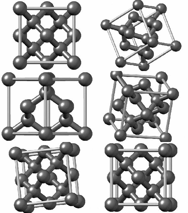
TL;DR: SLOW DOWN YOUR DAMN ANIMATED DIAGRAMS . Every critical stage of the animation should a clear view that stays for at least 1 second , and 2 if it's intricate Diamond's strong because of its crystal structure (I think). What's the crystal structure look like, anyway? Let's look at the Wikipedia page ! There's a nifty little animation: And it SUCKS. It's TOO FAST. Why are they rotating SO MUCH SO QUICKLY, with MOST of the time spent at TERRIBLE ANGLES where you CAN'T EVEN SEE ALL THE ATOMS. And the lines are THICK, WHYYY. It wasn't always this way. In 2017 the page had this animation: It's not perfect but it's much better . Thinner bond lines means it's easier to see the atoms. About half the time you get a clear view of all the atoms (you want to spend some time showing how they overlap from the right angles). The camera isn't swiveling fast all the time, so you get stretches of time that view the structure from about the same angle. Why do they use the new one? This certainly isn't the only time I've been frustrated by how fast explanatory animations move. I suspect it's because people are picking flashy animations that look cool to them, that show off how fancy they are, and